
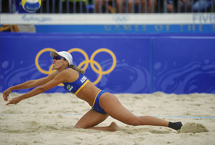
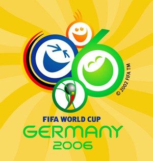
When it comes to the Olympic Games, most organizing committees stick with a proven color scheme - bright blues, reds, yellows, purples...basically just bright, vivid colors. Sometimes, it's hard to differentiate between years. Fortunately for us, there's four years between these things, so it's not as if it matters that every Olympics looks the same - it's the Summer Olympics, and we just want to feel like we're at some sort of global pool party. Compare the Olympics to its cousin, the World Cup, and you'll see that those tend to look (well, maybe not that one) like the places they are held.
And unless London moves to South Beach in 2012, the Olympics will still continue to look like they are trying to be generically summer-looking and not a reflection of where the games are held. On the Winter side, the same applies, with the cool colors used even more frequently. That said, I was always bothered by seeing a hot color like red around the ice, like this in Turin in 2006.
Using a widely-accepted color scheme isn't a bad thing on the Olympics' part, just an observation, and I'm certainly not saying that each Olympics doesn't add a bit of its own cool local touch. However, the Olympics have really started to blend together, visually. This one's just a bit more interesting because of its East-meets-West ramifications.
It was clear from the onset that the 2008 Summer Olympics were China's opportunity to present its new self to the world, one where the rapidly growing nation states its intentions of
But we the viewers at home at these events don't really matter. I'm sure that, being in Beijing, one is smacked in the face with all kinds of obtrusive advertising, but watching at home, it's kind of nice not to be, for once (outside of commercials, but that's why I DVR). Compare the advertising boards surrounding the fields at Olympic Soccer to World Cup Soccer. Pretty nice not to have tons of advertising, isn't it? Inside the stadiums, there isn't any advertising either, just exclusive soft drinks and ways to pay for them. Essentially, corporations at these Games are unconcerned with us, the worldwide television viewer for once. Instead, their focus lies solely on the 1.3 billion Chinese people, who are relatively new to many of the brands that have been established in the West for decades.
Susan Gunelius writes: "It’s no longer sufficient for a nation to host an Olympiad, they must embody the games. The host city must be welcoming and accommodating for thousands of athletes and spectators, not to mention the billions of television viewers. All these eyeballs mean that design is at the forefront. Branding the Olympics is the act of using design to create a unique experience. To attach thoughts and feelings to those specific games, and remind generations to come what it means to represent your country overseas."
While the above is certainly true, why do so many Olympics - and World Cups, for that matter - rely on using so similar designs? One could look at this a number of different ways, usually boiling down to two: 1) it's hard to appeal to an entire world of people, and 2) that each design has to embody the Olympic Spirit. In most cases, simple, unoffensive design meets both of those criteria. Tread carefully, London.
Part 2 - Venues and Gear
No comments:
Post a Comment